
Amped Up
About this project
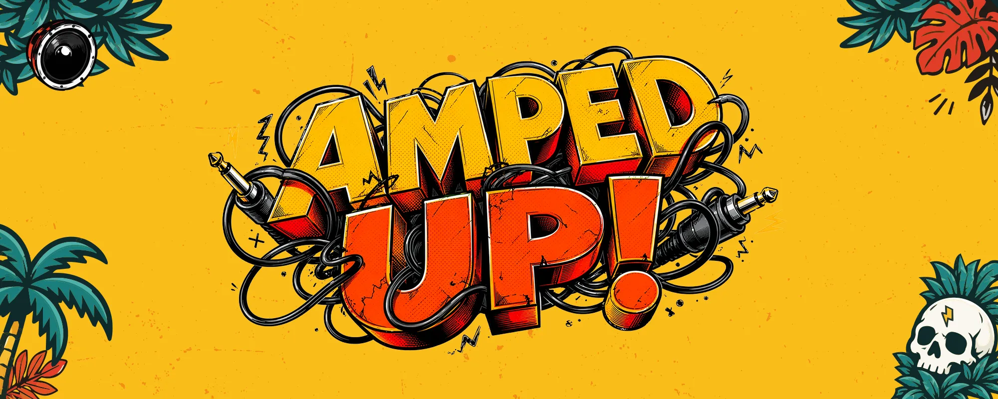
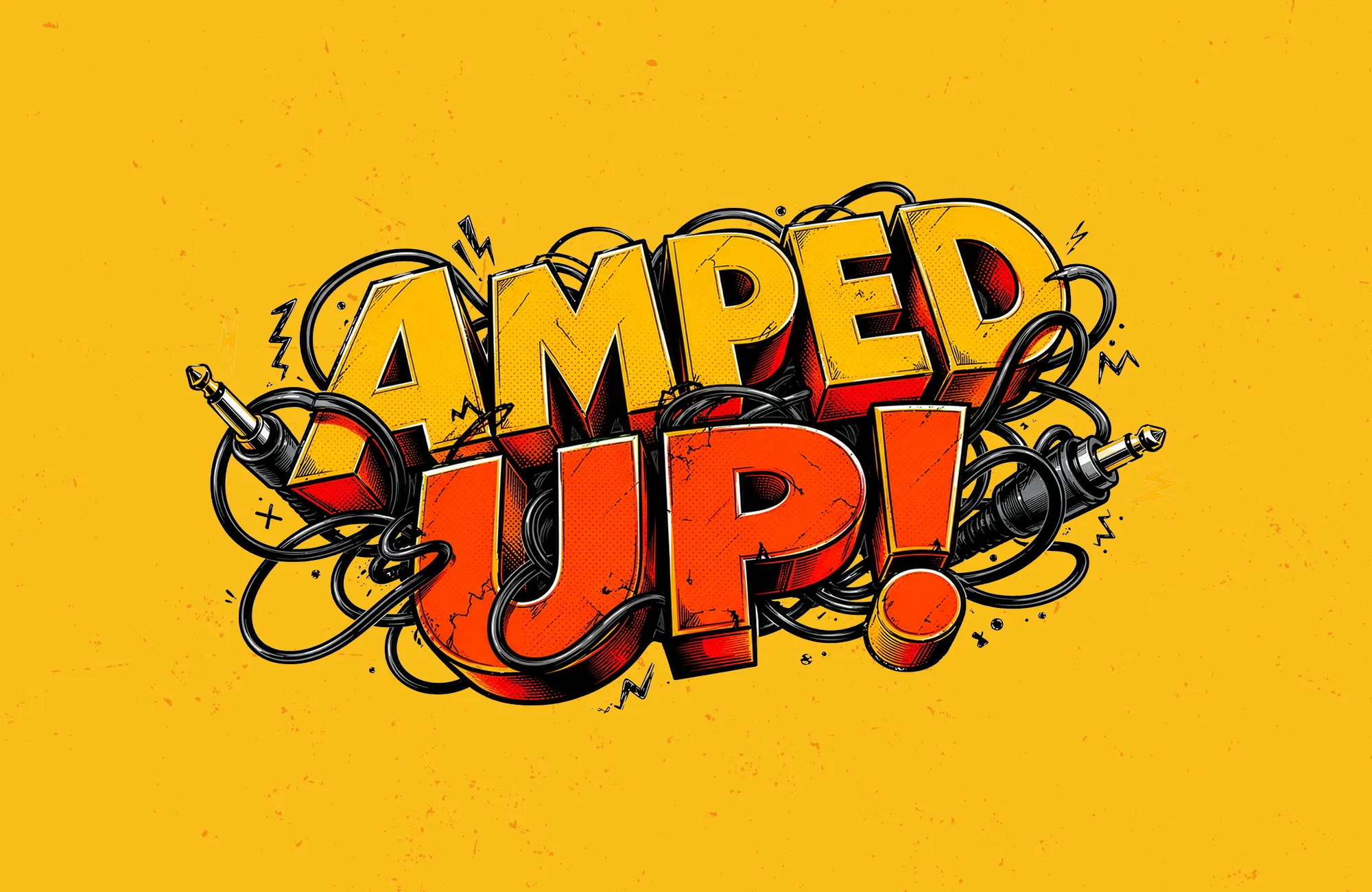
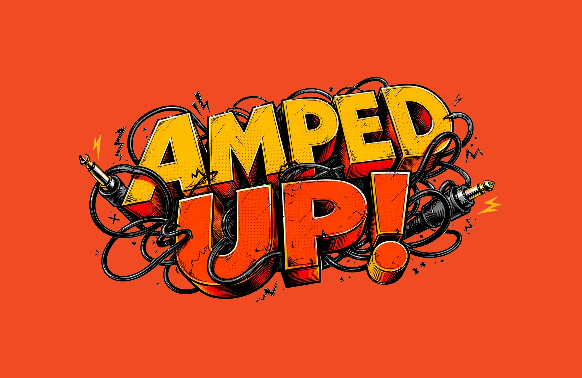
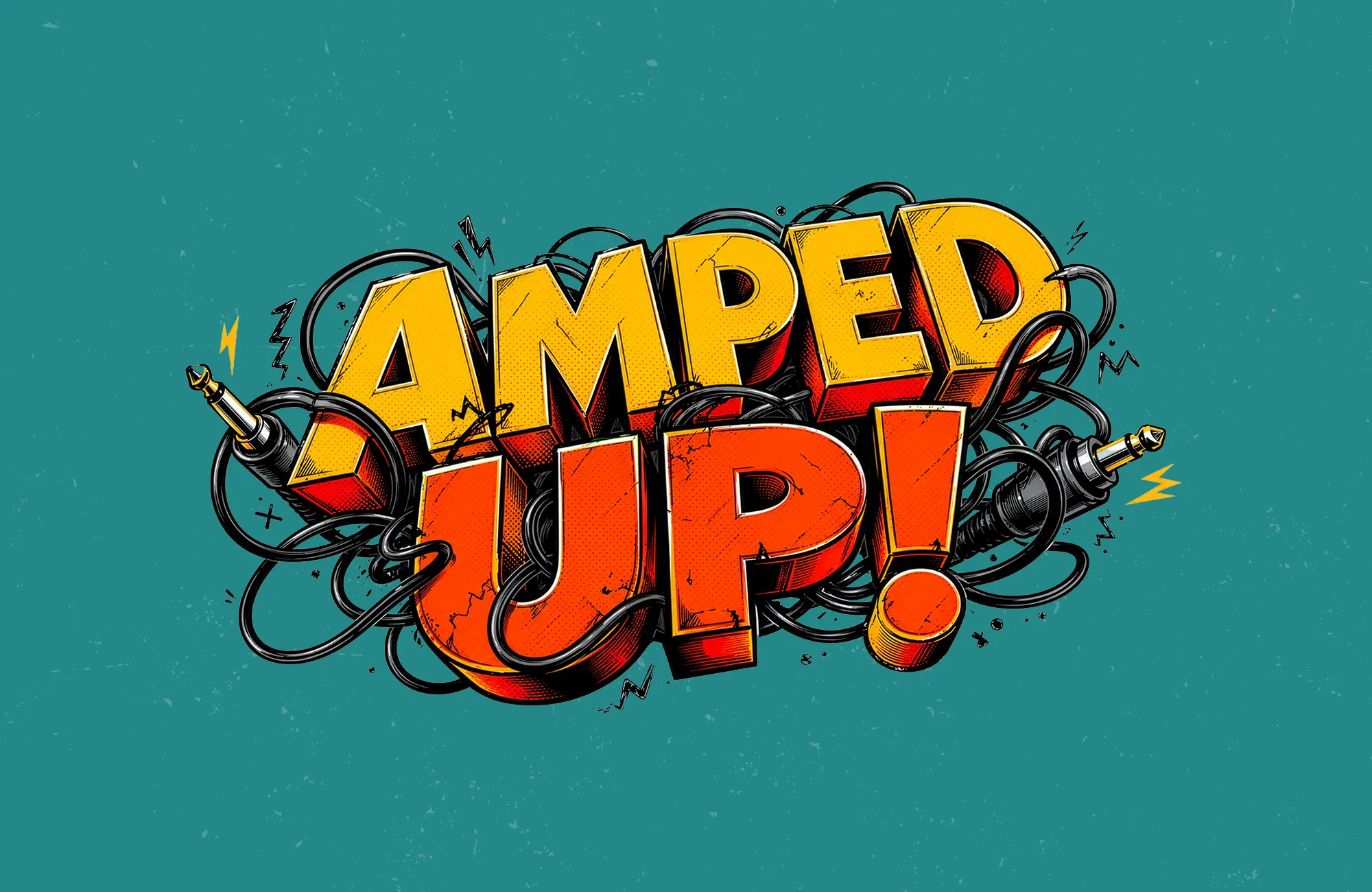
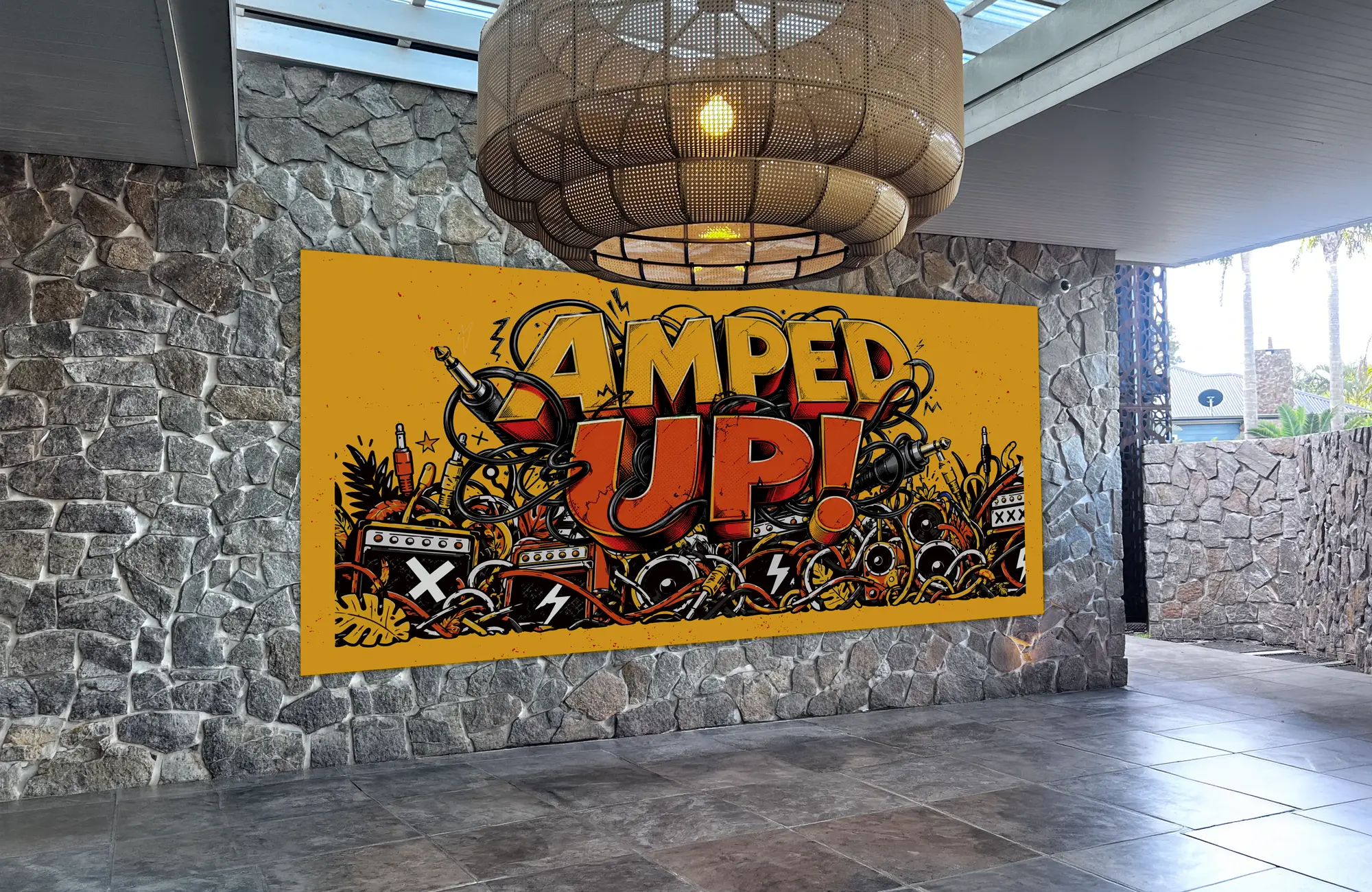
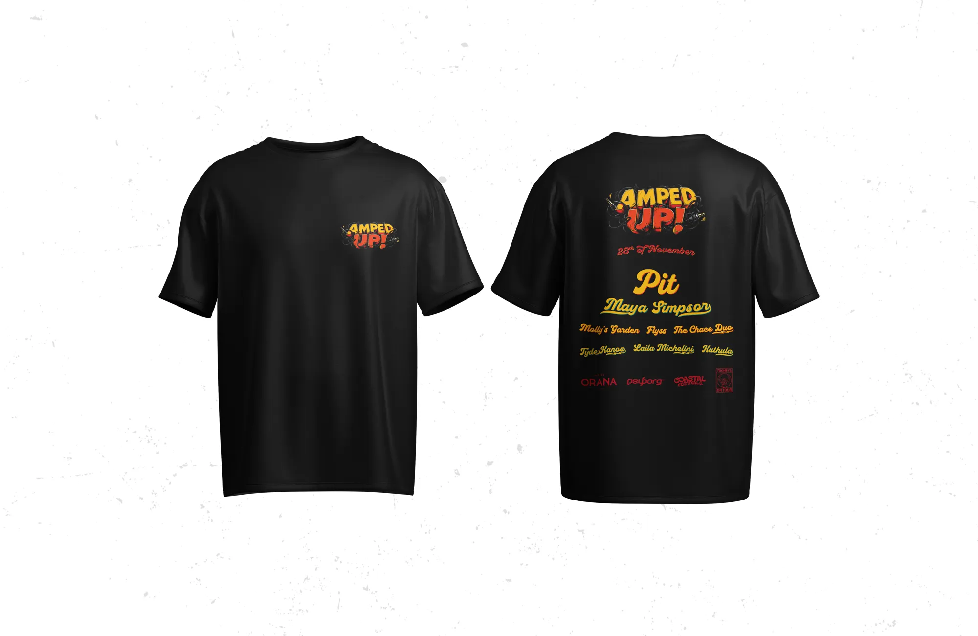
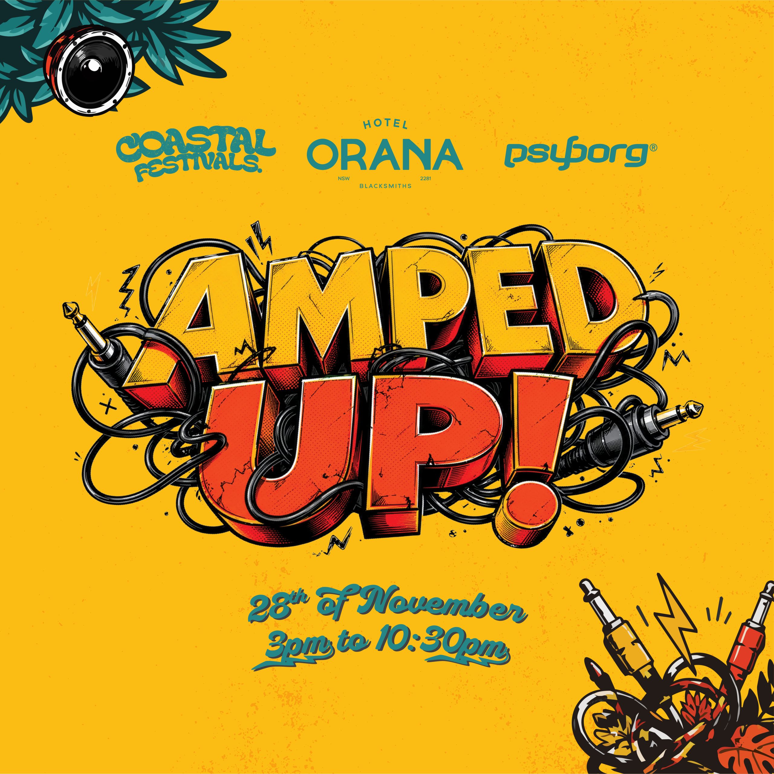
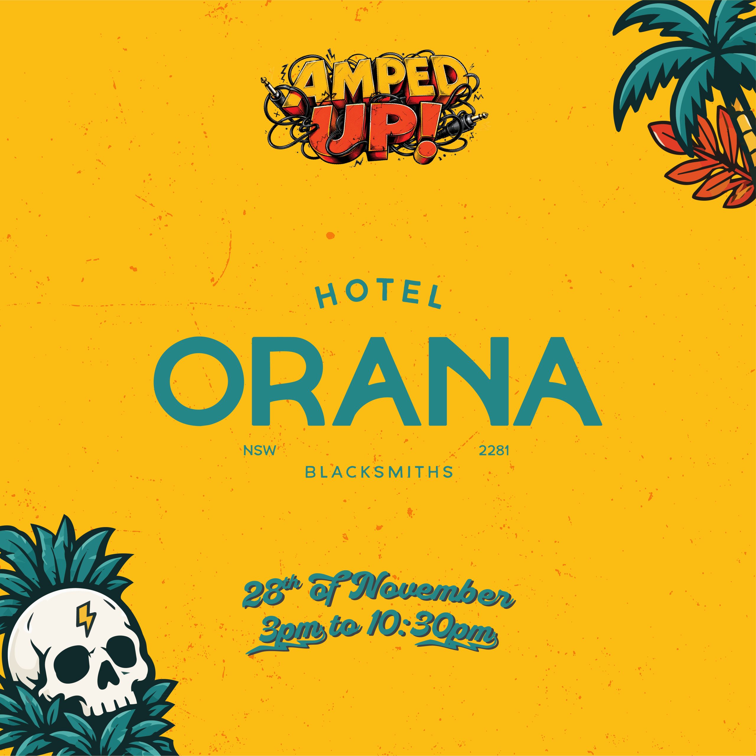
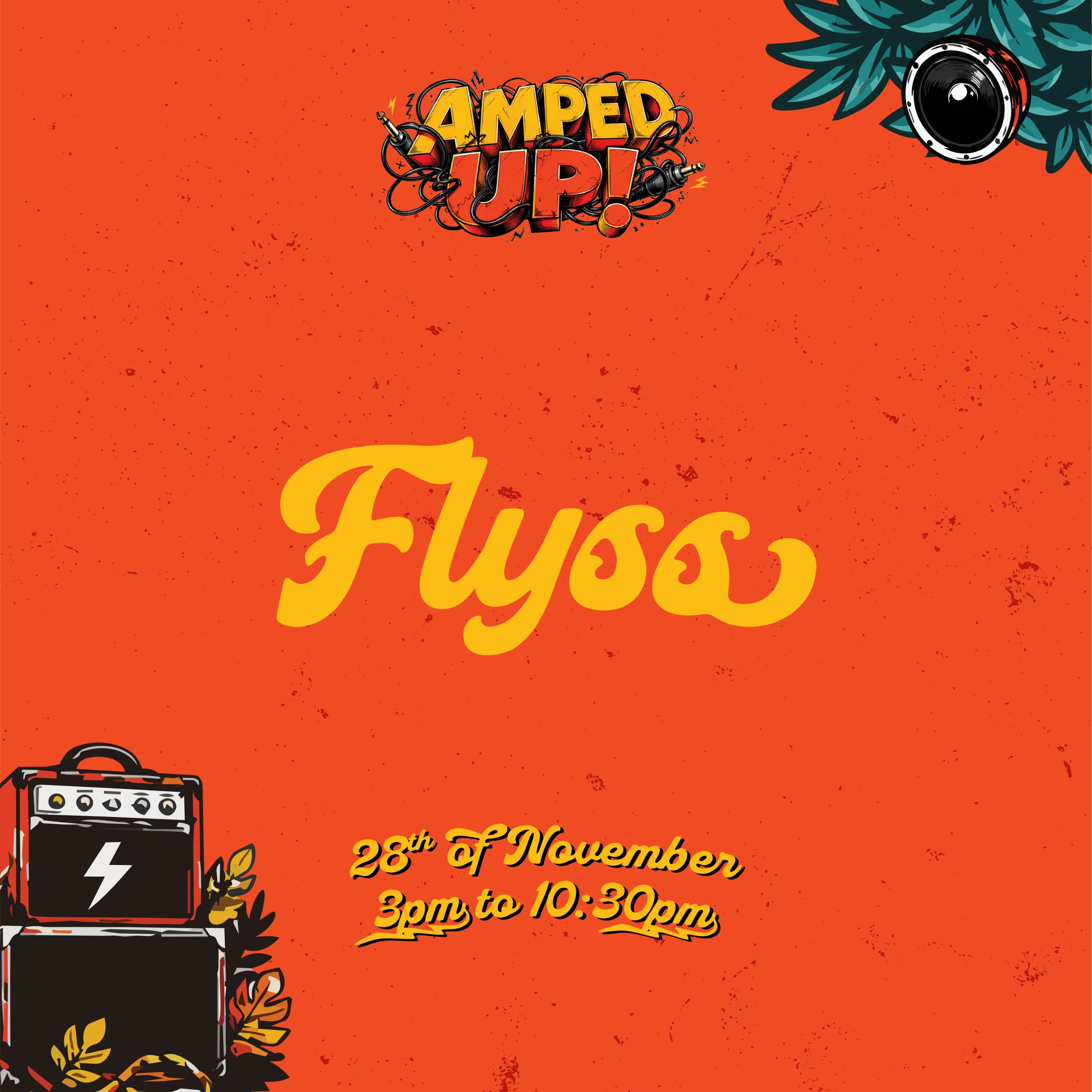
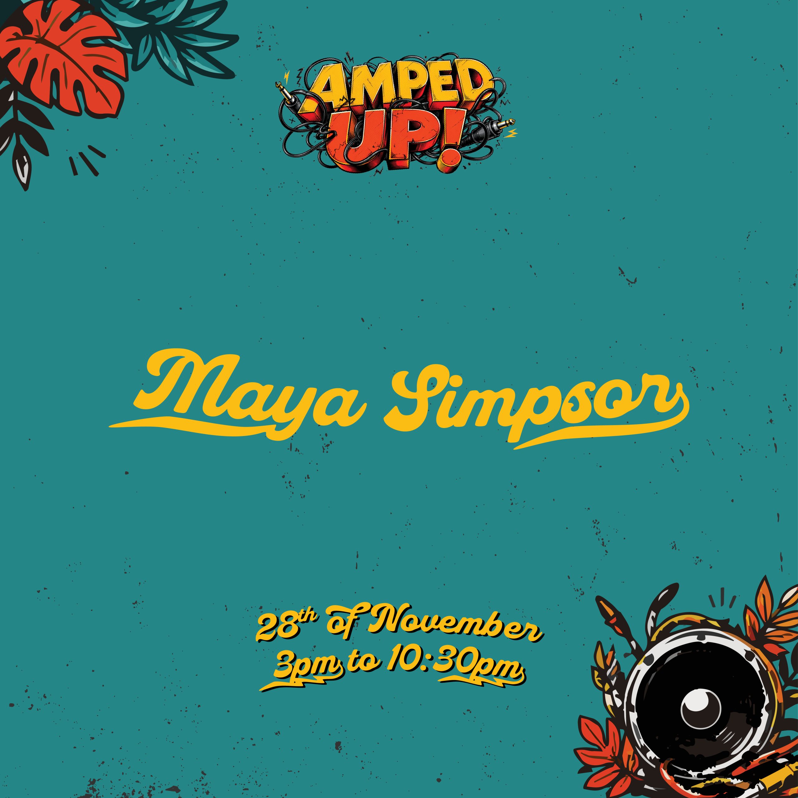
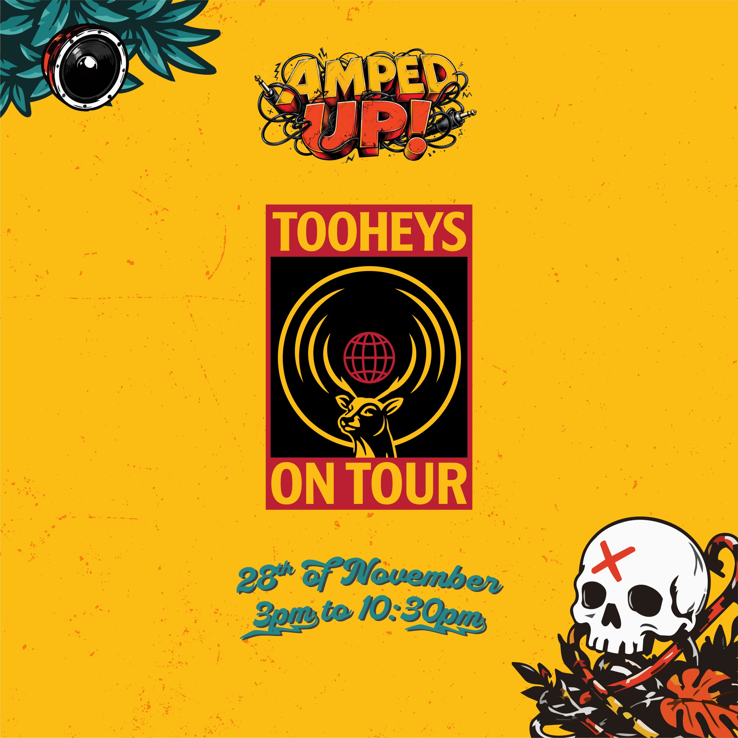
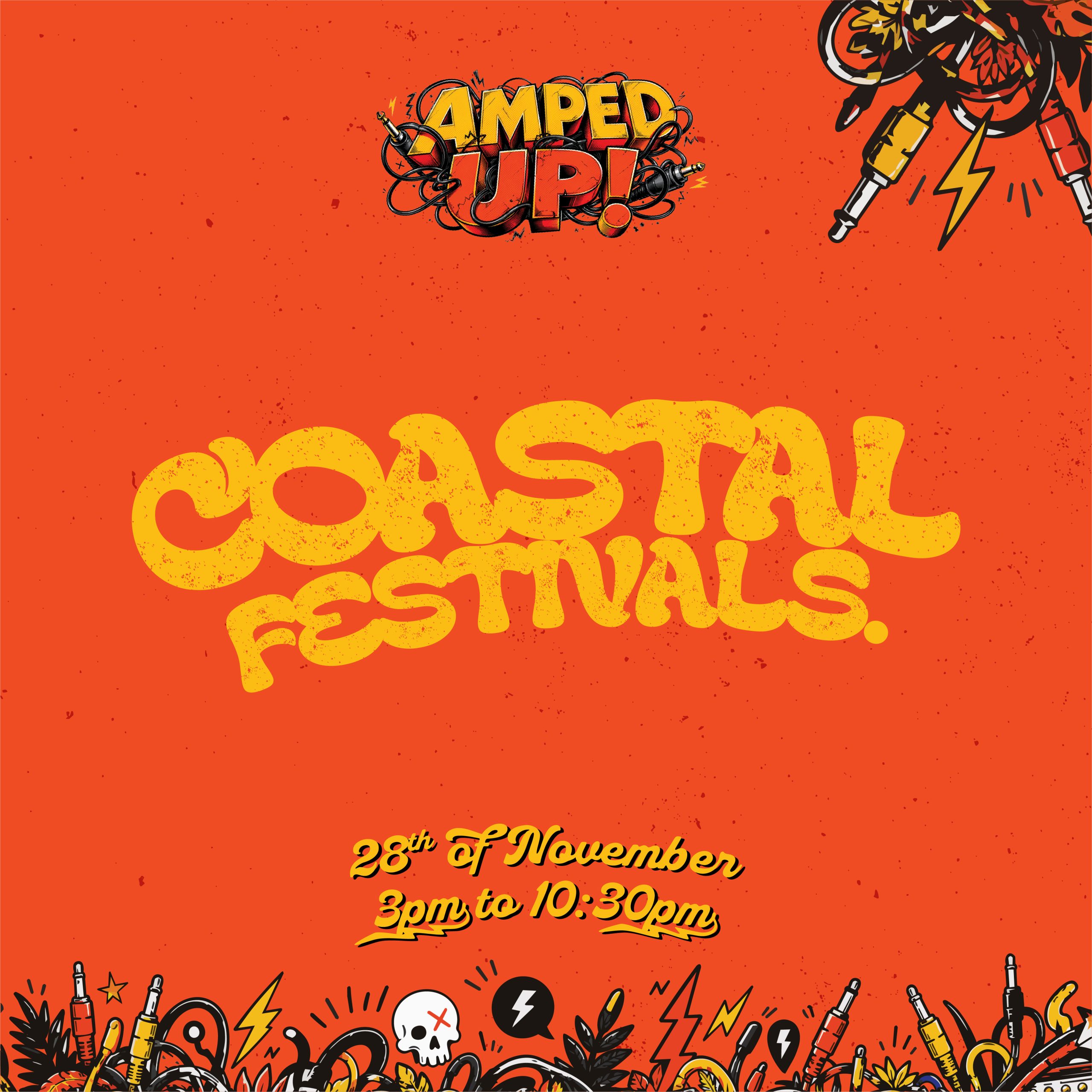
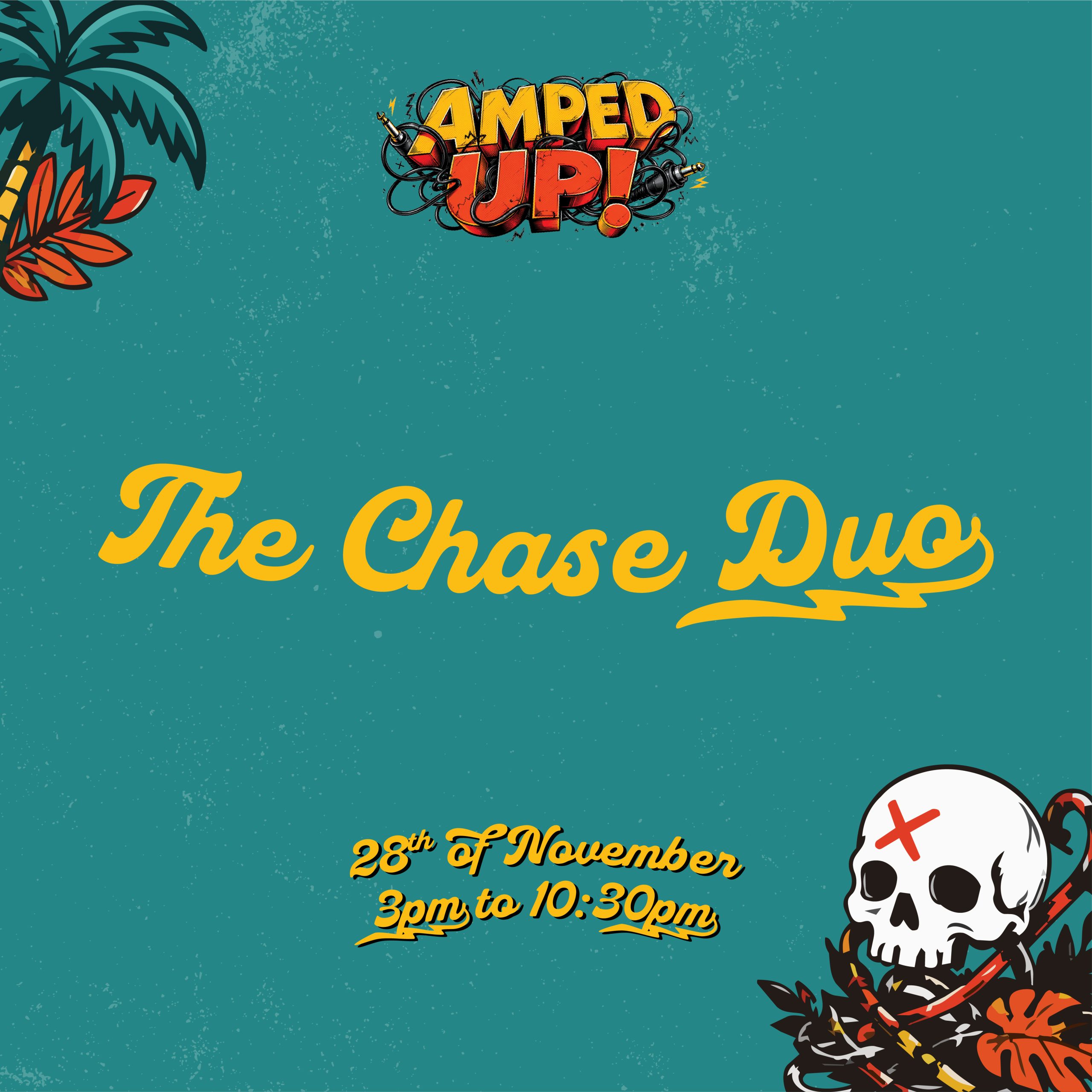
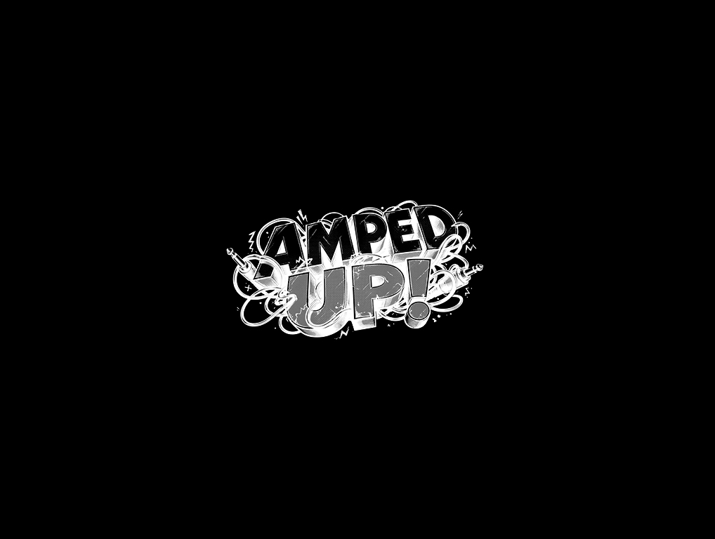
Amped Up does not behave like a flat event graphic! We designed Amped Up to behave like live music feels … loud, layered, restless and full of movement.
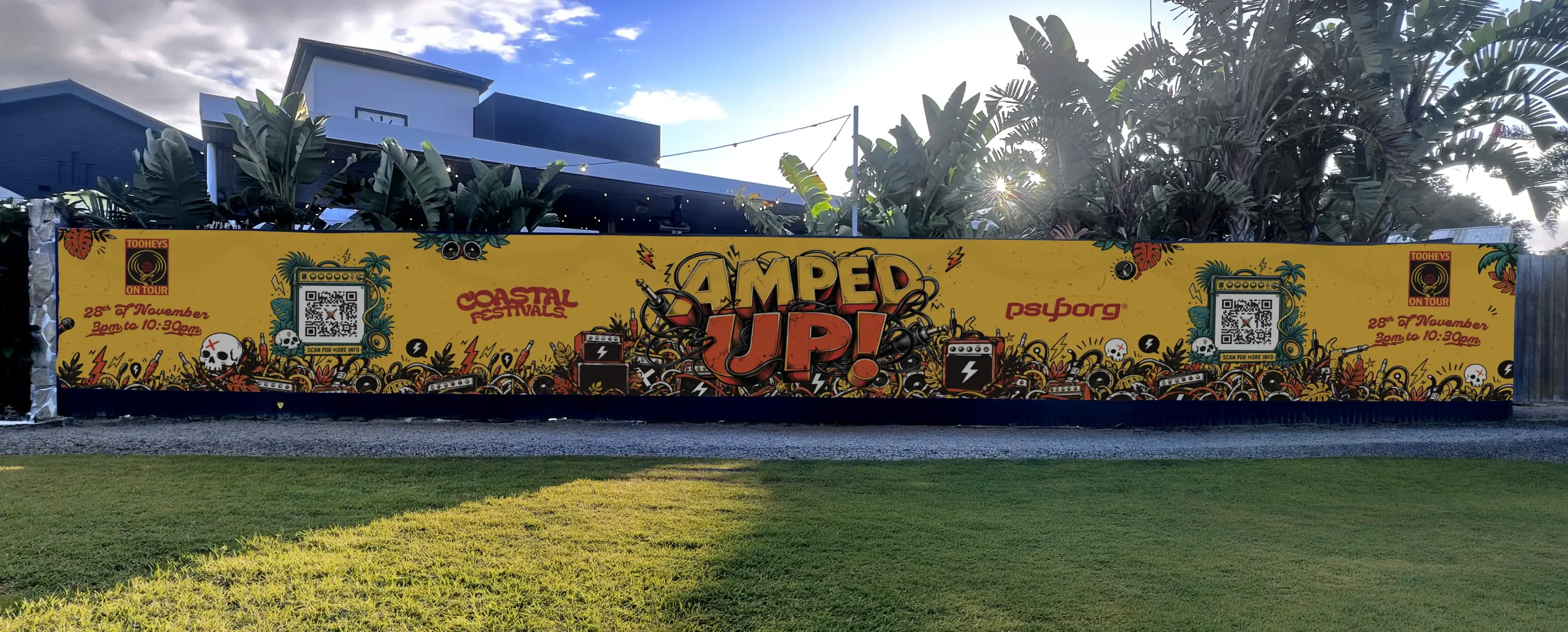
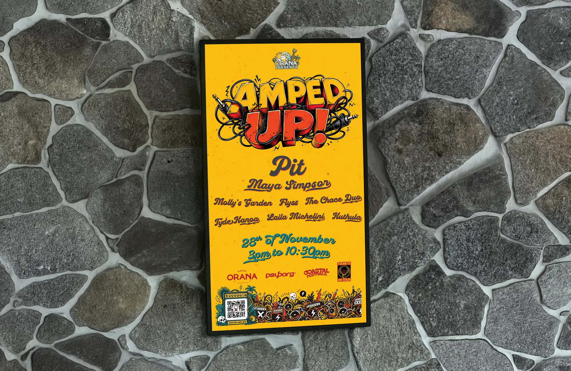
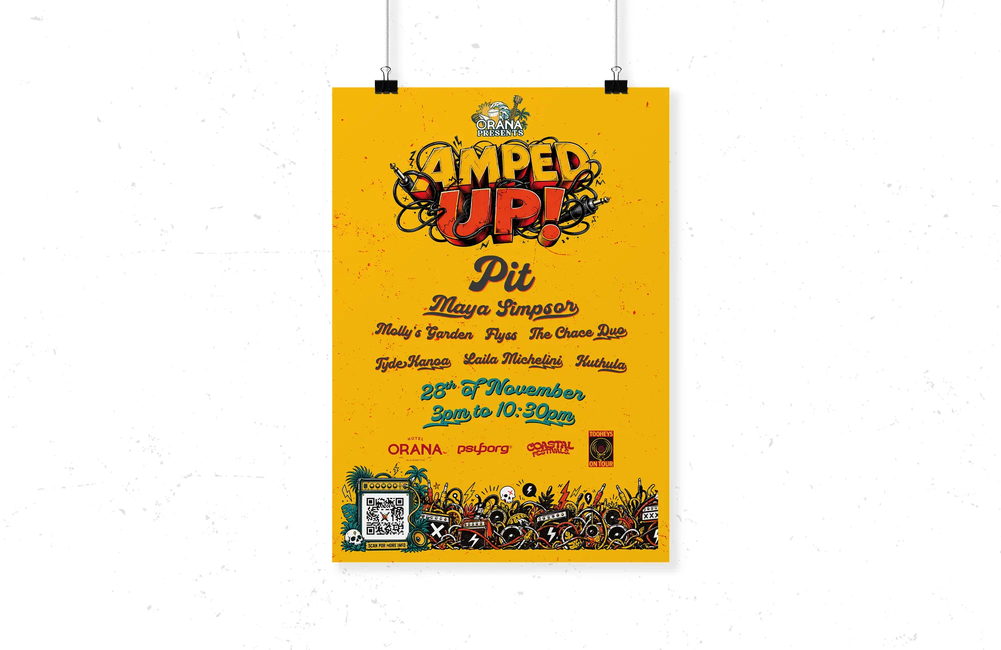
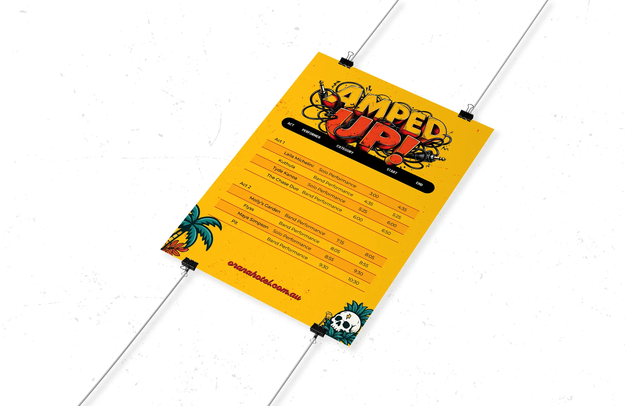
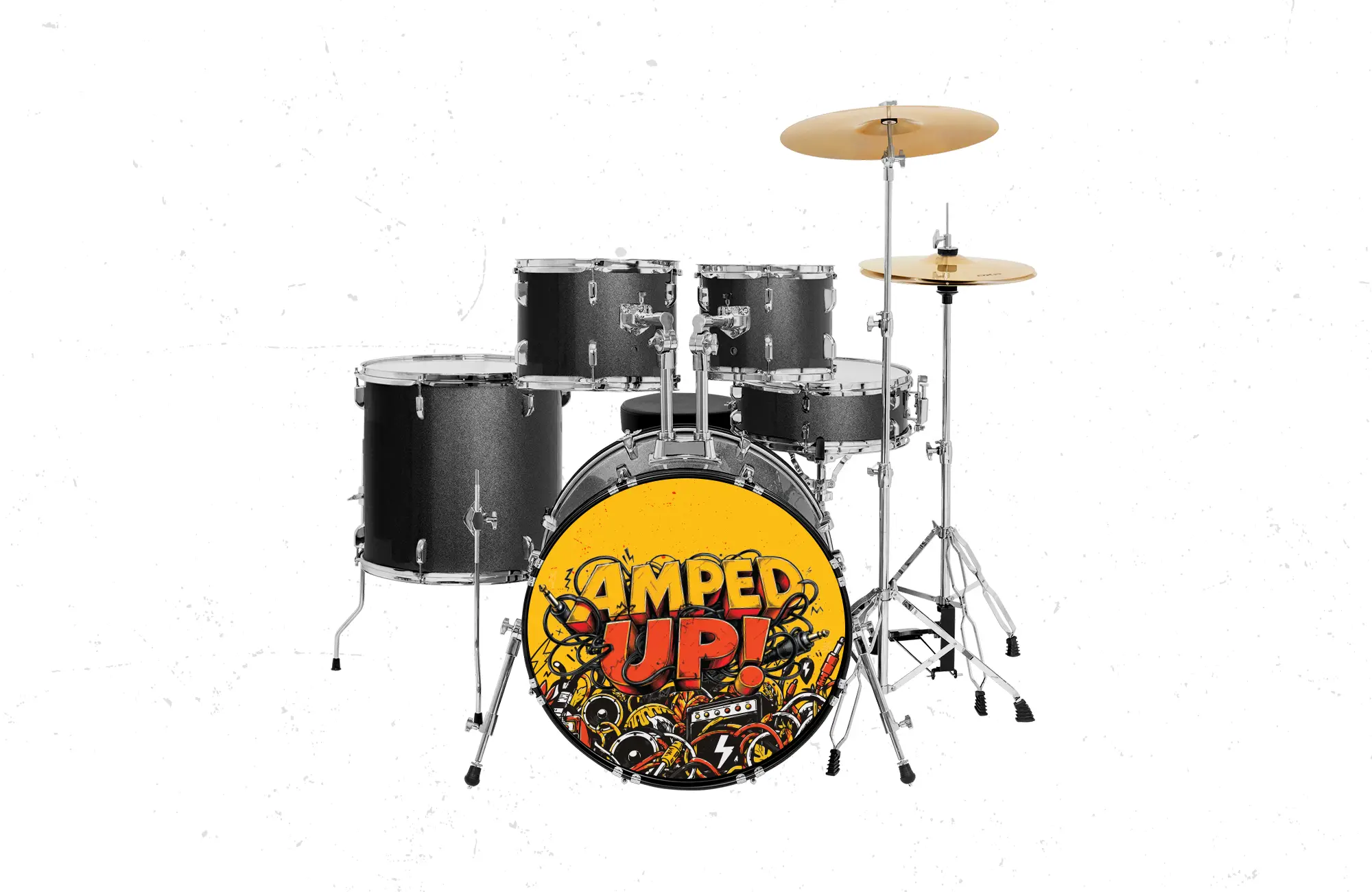
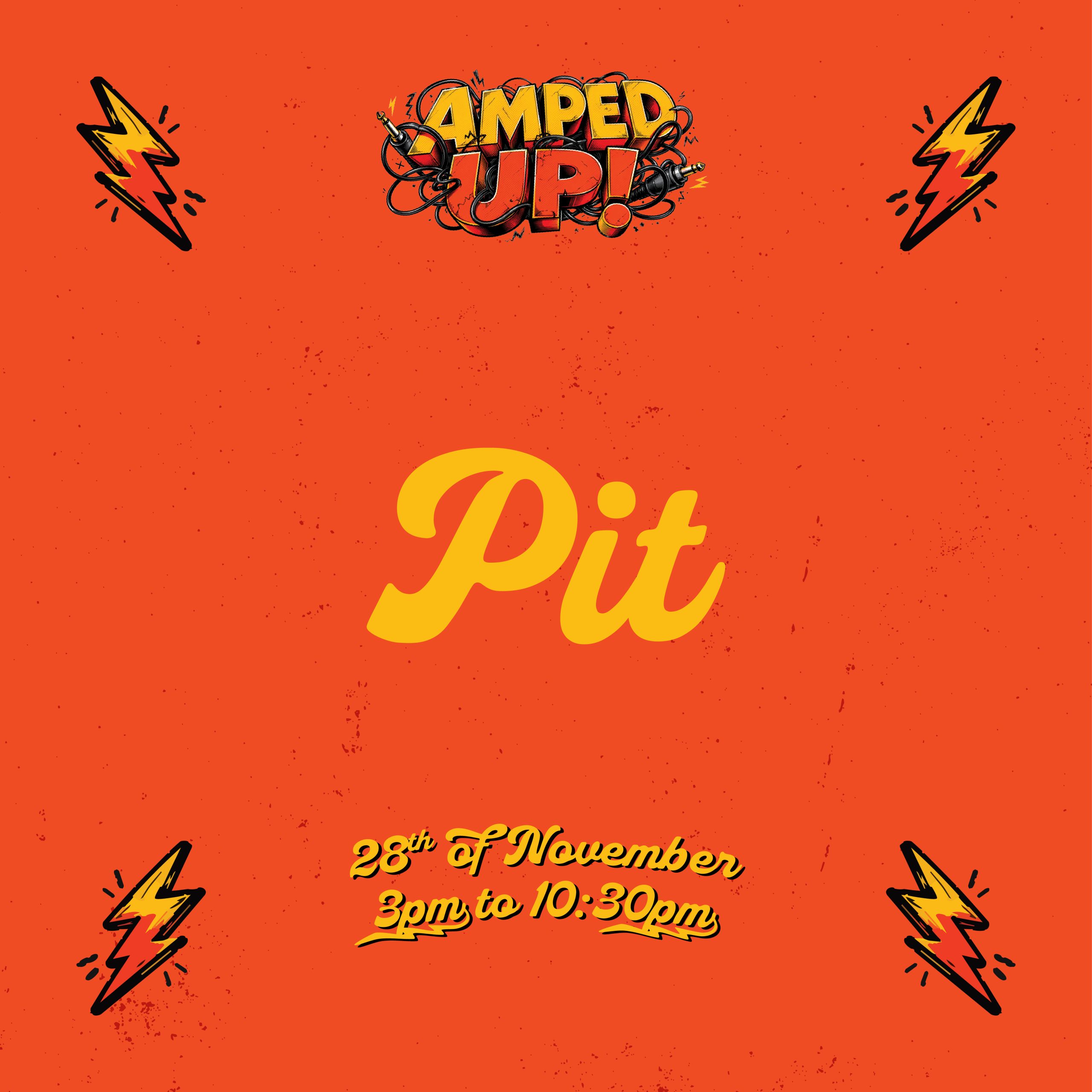
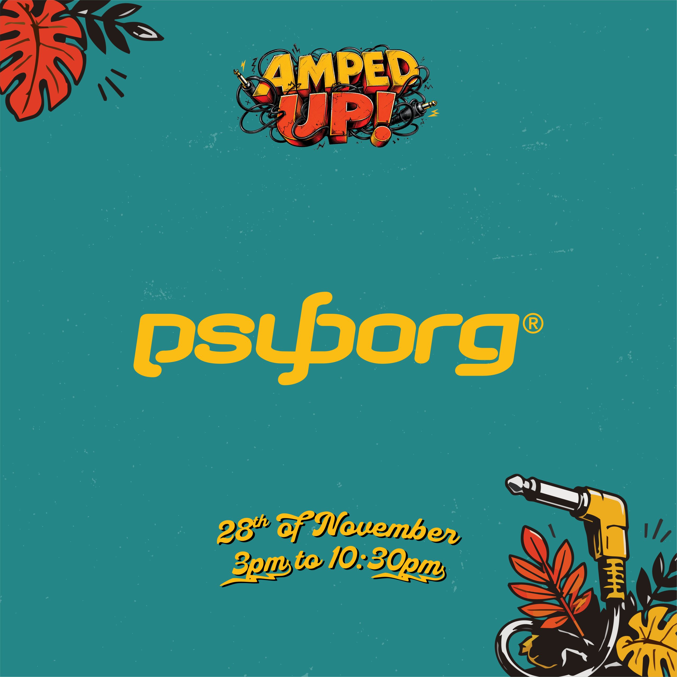
The identity system takes the familiar language of amplified sound … cables, plugs, speakers, amps, lightning bolts and stage energy … and turns it into a visual world that can stretch across posters, roadside artwork, social media, merchandise, podcast artwork and event touchpoints. This matters because the project needed more than a logo. It needed a campaignable sub-brand with enough attitude to live across many formats.
The design works through controlled chaos. The typography is bold and immediate while the illustrated cords and music symbols create energy around it. This gives the brand a strong centre with expressive edges. It feels wild without becoming messy. The palette of yellow, orange, teal, black and white gives the campaign punch, contrast and flexibility. It can feel loud on screen, practical in print and strong enough for screen printing or merchandise.
The broader campaign system also gives Amped Up a strong event voice. Supporting elements such as icon sets, grunge textures, borders, QR graphics and cable-style taglines create a complete visual language. Each piece feels related but not repetitive. That makes the brand useful, memorable and easy to deploy.
In short, we designed Amped Up to capture the physical energy of live sound. It’s not just designed to be seen. It’s designed to feel plugged in.













About
psyborg® helps organisations find clarity through brand strategy, design, web and practical AI systems. Based in Caves Beach, Lake Macquarie.
part mind | part machine
Get In Touch
m. (+61) 414 914 087
e. info@psyborg.com.au
Suite 2, Shop 3
3 Mawson Close
Caves Beach 2281
NSW, Australia