Have you ever wondered what makes a logo unforgettable? It’s not just about a catchy design; it’s about visual equity. At psyborg®, we’ve mastered the art of crafting logos that don’t just stand out but also stand the test of time. Let’s dive into the world of visual equity and explore how our logos have been pivotal in transforming brands.
The Essence of Visual Equity in Logo Design
Visual equity is the value derived from a logo’s visual elements. It’s about how shapes, colours, and symbols converge to create an identity that resonates with audiences. In today’s competitive marketplace, a logo is not just a symbol; it’s a visual storyteller. It encapsulates your brand’s ethos, mission and values.
Elements Contributing to Visual Equity
At psyborg®, we focus on three core elements:
- Colour: It’s not just about aesthetics; colours evoke emotions and convey messages.
- Shape: Simple yet powerful, the right shape can make your logo memorable.
- Symbolism: Every symbol has a story. We ensure your logo tells yours effectively.
Case Studies from the psyborg® Portfolio
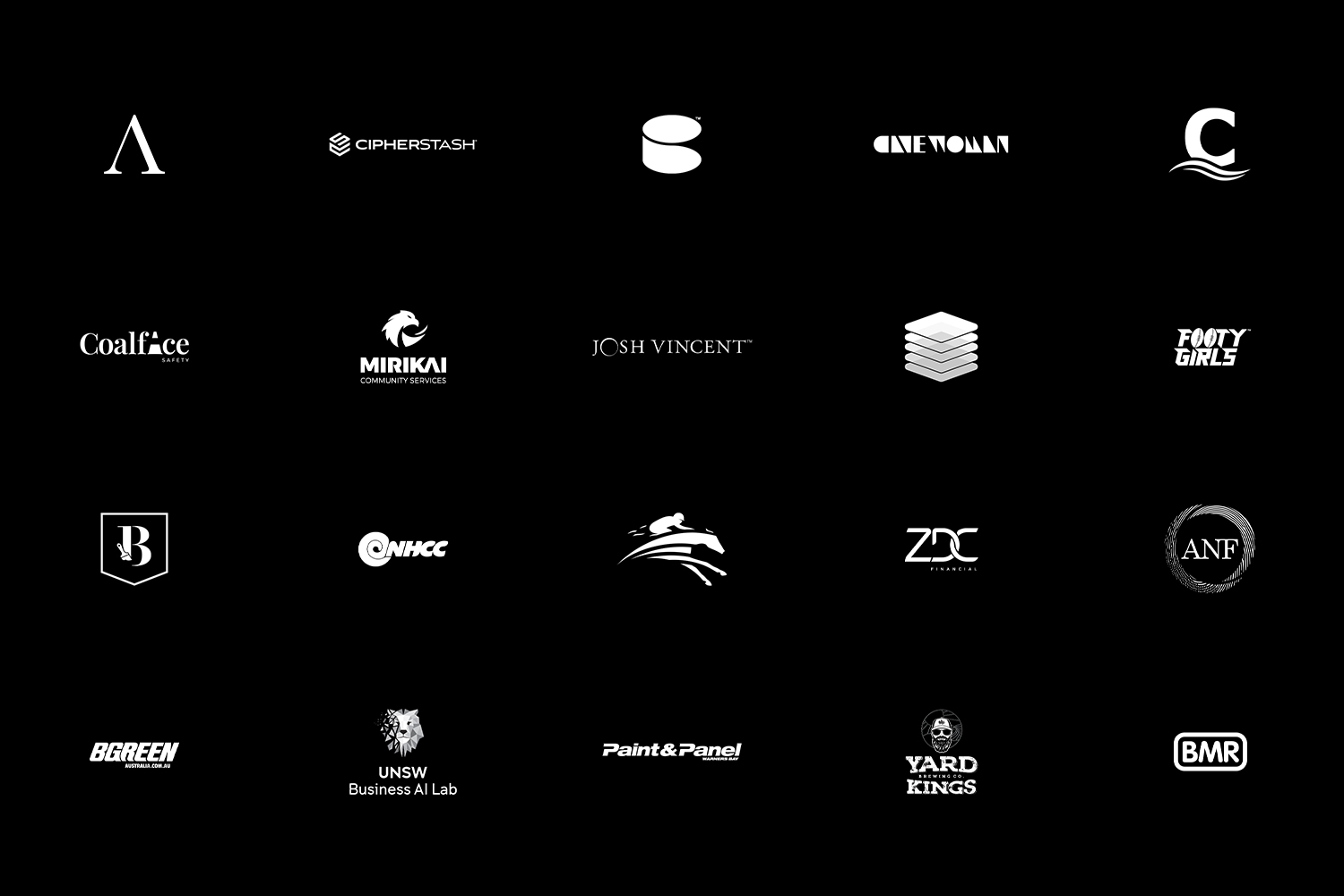
Our portfolio is a testament to our commitment to visual equity. Here are a few examples:
This logo’s vibrant colours and dynamic shape embody the energy and innovation that the brand it represents.
Check out our work on this logo here.
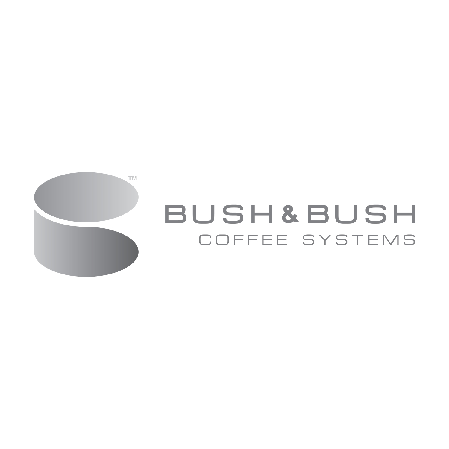
With its minimalist design and symbolism, combining the shape of a ‘B’ and the form of a density press, the brands hero product, the Bush & Bush logo captures the essence of this brand’s sophistication.
Check out our work on this logo here.
Our redesigns aren’t just about changing looks; they’re about elevating brand identities. We reframed an unnecessary perception of a local women’s boutique, reframing it to be perceived as the contemporary and fashionable store that it is.
Check out our work on this logo here.
The Process Behind Creating Visually Equitable Logos
Our approach is creative yet systematic or as we put it, part mind, part machine:
- Understanding the Brand: We dive deep into your brand’s story through our Brand Workshops.
- Conceptualisation: Ideas are transformed into visual representations.
- Collaboration: Your feedback is integral to our process.
The Outcome – Measuring Visual Equity
Our clients have seen tangible benefits from the logos we’ve created. Increased brand recognition and customer engagement are just the tip of the iceberg.

From our very first “Brand Workshop” meeting, Dan listened to us and explained the importance of the branding and creative design process involved from logo design, colours, your audience and how important it is to get all the elements consistent.
Scott Browne & Robbie James
Directors
e365 realestate
Quantitative Measures
While visual equity is often felt, we strive to measure its impact through customer feedback and brand performance metrics.
Conclusion
In the realm of logo design, visual equity is king. At psyborg®, we don’t just create logos; we aim to create brands.
Dive into our portfolio to see the difference visual equity can make.
Ready to transform your brand? Let’s connect!

Daniel Borg
Creative Director
psyborg® was founded by Daniel Borg, an Honours Graduate in Design from the University of Newcastle, NSW, Australia. Daniel also has an Associate Diploma in Industrial Engineering and has experience from within the Engineering & Advertising Industries.
Daniel has completed over 2800 design projects consisting of branding, content marketing, digital marketing, illustration, web design, and printed projects since psyborg® was first founded. psyborg® is located in Lake Macquarie, Newcastle but services business Nation wide.
I really do enjoy getting feedback so please let me know your thoughts on this or any of my articles in the comments field or on social media below.
Cheers Daniel

